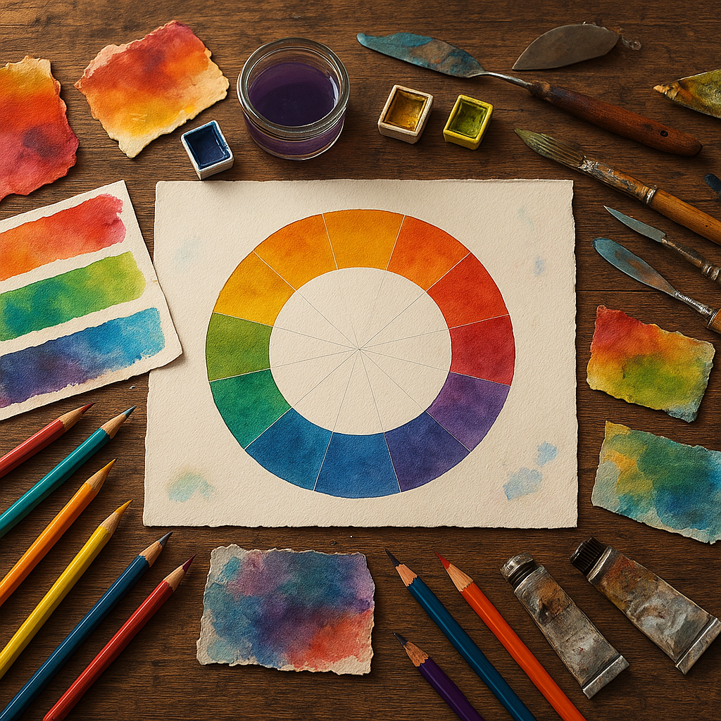
Color theory can feel like one of those topics that’s endlessly discussed but rarely made practical — especially for mixed media artists juggling paint, collage, ink, fabric, and everything in between. Unlike painters working strictly in oils or watercolor, mixed media work introduces a wild mix of surfaces, textures, and materials that respond to color in unpredictable ways. Understanding the core principles of color theory isn’t just academic; it’s what separates a piece that feels cohesive from one that feels chaotic.
Whether you’re layering acrylic over tissue paper, stamping onto fabric, or combining photography with hand-painted elements, the same foundational rules apply — and once you internalize them, color decisions start happening intuitively rather than through guesswork.
The Color Wheel: More Than a Classroom Relic
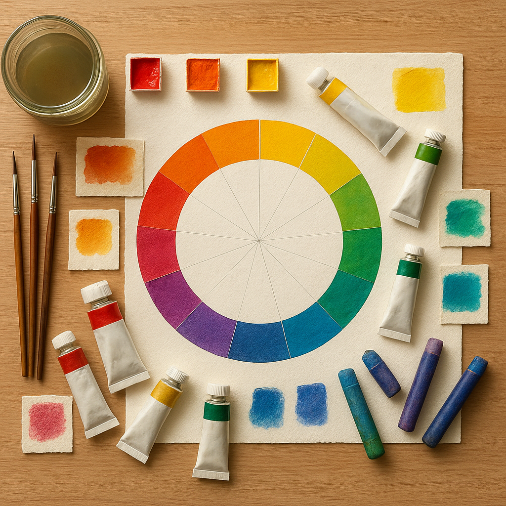
The color wheel is the starting point for everything. It’s not just a tool for beginners — professional artists return to it constantly because it maps relationships between colors in a way that’s genuinely useful.
The traditional RYB (red, yellow, blue) color wheel is the one most often used in fine art and mixed media contexts. It organizes colors into three categories:
- Primary colors: Red, yellow, and blue — these can’t be created by mixing other colors together.
- Secondary colors: Orange, green, and violet — each formed by mixing two primaries.
- Tertiary colors: The in-between hues like red-orange, yellow-green, and blue-violet — made by mixing a primary with an adjacent secondary.
In digital art contexts, you’ll encounter the RGB (red, green, blue) model instead, which works with light rather than pigment. This distinction matters if you’re creating mixed media work that moves between analog and digital formats, since colors can shift significantly between the two systems.
Color Properties: Hue, Value, and Saturation
When artists talk about color theory, they’re really talking about three distinct properties that every color possesses. Confusing these is one of the most common stumbling blocks for developing artists.
Hue
Hue is simply the color itself — red, blue, yellow, turquoise. It’s the name we give to a color’s position on the color wheel. When you say something is “green,” you’re describing its hue.
Value
Value refers to how light or dark a color is. Adding white to a hue creates a tint; adding black creates a shade; adding gray creates a tone. Value is arguably the most important of the three properties — many artists argue that getting values right matters more than choosing the “correct” colors. A composition with strong value contrast will read clearly even in a black and white photograph.
Saturation
Saturation (also called chroma or intensity) describes how vivid or muted a color is. A fully saturated red is fire-engine bright; a desaturated red starts to look brownish or grayish. In mixed media work, desaturated colors often read as more sophisticated and are easier to layer without visual clutter.
Color Harmonies: Building Palettes That Work
Color harmony refers to the pleasing arrangement of colors based on their relationships on the color wheel. There are several classic harmony schemes, and each produces a different emotional effect.
Complementary Colors
Complementary colors sit directly opposite each other on the color wheel — think red and green, or blue and orange. Placed side by side, they create high contrast and visual vibration. This is why sports teams often wear complementary colors; the combination demands attention. In mixed media art, small amounts of a complement can make a dominant color pop dramatically.
Analogous Colors
Analogous color schemes use three or more colors that sit next to each other on the wheel — like yellow, yellow-green, and green. These palettes feel natural and harmonious because they mimic the way colors often appear in nature. They’re a safe, elegant choice for backgrounds and layered textures in mixed media work.
Triadic Colors
A triadic palette uses three colors evenly spaced around the wheel, like red, yellow, and blue, or orange, green, and violet. Triadic schemes are vibrant and balanced but require careful handling — usually one color dominates while the other two serve as accents.
Split-Complementary and Tetradic Schemes
A split-complementary scheme uses a base color plus the two colors adjacent to its complement, offering contrast without the full tension of a direct complement. Tetradic (or double-complementary) schemes use four colors in two complementary pairs — rich and complex, but demanding to balance.
Understanding Color Temperature
Color temperature is one of those concepts that transforms how you see the world once it clicks. Colors are broadly categorized as warm (reds, oranges, yellows) or cool (blues, greens, purples), but the reality is more nuanced — every color has a relative temperature.
For example, some reds lean warm (like cadmium red, which pulls toward orange) and some lean cool (like alizarin crimson, which pulls toward blue). This distinction matters enormously when mixing colors, because mixing a warm red with a cool blue will give you a very different result than mixing a cool red with a warm blue.
In mixed media compositions, warm colors tend to visually advance (come forward) while cool colors recede, which gives you a powerful tool for creating depth across your layers without relying solely on physical dimension.
Answering the Big Color Theory Questions
What is the 70/20/10 Rule for Colors?
The 70/20/10 rule is a practical guideline for building balanced color palettes. The idea is that 70% of your composition uses a dominant color, 20% uses a secondary color that complements or contrasts the dominant, and 10% is reserved for an accent color that adds energy or visual interest. This ratio keeps compositions from feeling too chaotic or too monotonous. In mixed media work, thinking in these proportions when selecting papers, paints, and embellishments can make a significant difference in the final cohesiveness of a piece.
What Are the 7 Types of Color Theory?
Color theory is a broad field, but it’s often broken into several core concepts: the color wheel, color harmony, color temperature, color value, color saturation, simultaneous contrast (how colors look different depending on surrounding colors), and color psychology (how colors evoke emotional responses). Together, these seven areas cover most of what an artist needs to make intentional, informed color decisions.
What Three Colors Cannot Be Mixed Together?
The primary colors — red, yellow, and blue — cannot be created by mixing other pigment colors together. They are the origin point of all other colors in the traditional color model. In the additive (light-based) RGB model used in digital art, the primaries are red, green, and blue, and they also cannot be mixed from other light sources. This is why they’re called “primary” — everything else derives from them.
What is the 70/30 Rule in Art?
The 70/30 rule is a simpler version of proportional thinking in art. It suggests that compositions feel most dynamic when there’s an uneven split — for example, 70% busy/textured areas and 30% open/calm space, or 70% of one dominant color family and 30% contrast. Equal 50/50 divisions tend to feel static and unresolved, while a 70/30 split creates visual tension and movement that keeps the viewer’s eye engaged.
Color Psychology: The Emotional Layer
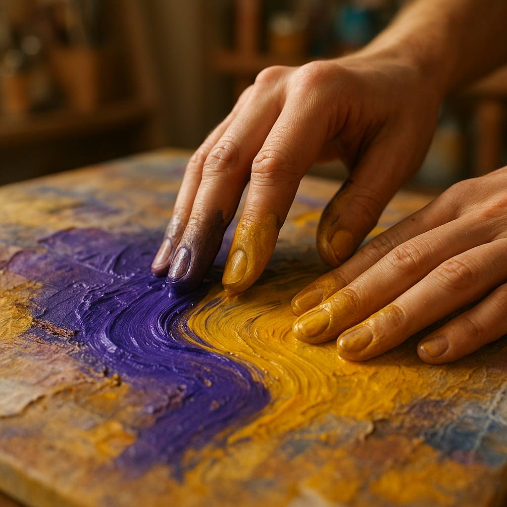
Beyond the mechanical relationships between colors lies the deeply human dimension of color psychology. Colors carry cultural associations and trigger emotional responses — some fairly universal, others highly personal or culture-specific.
- Red evokes energy, passion, urgency, and intensity.
- Blue suggests calm, trust, depth, and melancholy.
- Yellow communicates optimism, warmth, and playfulness — but in excess, can feel overwhelming.
- Green connects to nature, growth, balance, and healing.
- Purple carries associations with mystery, spirituality, and luxury.
- Orange is enthusiastic, inviting, and energetic without the aggression of red.
- Neutrals (black, white, gray, brown) provide grounding and can dramatically shift how surrounding colors read.
For mixed media artists, understanding color psychology adds another layer of intentionality to the work. If a piece is meant to feel nostalgic and soft, leaning toward muted, warm tones with creamy neutrals will support that mood. If the goal is energy and disruption, high-saturation complements with sharp contrast will deliver it.
Practical Tips for Applying Color Theory in Mixed Media Work
Theory is only as valuable as its practical application. Here are several ways to bring these concepts directly into your mixed media practice:
- Create a limited palette intentionally. Choose three to five colors before starting a project — including at least one neutral — and commit to working within them. Constraints breed creativity and cohesion.
- Test color interactions before committing. Mixed media surfaces respond differently than canvas or watercolor paper. Test how your colors layer on the actual substrate you’re using.
- Use a value scale. Squint at your composition — if everything blurs into the same value, the piece will lack depth regardless of how interesting the colors are individually.
- Let one color dominate. Return to the 70/20/10 principle when a composition starts feeling overwhelming. Ask which color should “win” and adjust accordingly.
- Introduce neutrals strategically. Grays, tans, and off-whites aren’t boring — they’re the breathing room that makes saturated colors sing.
- Study pieces you love. When you encounter art that moves you, analyze the palette. What harmony scheme is at work? What’s the dominant temperature? What proportion does each color occupy?
Simultaneous Contrast: Why the Same Color Looks Different
One of the most mind-bending aspects of color theory is the concept of simultaneous contrast, first formally described by the French chemist Michel Eugène Chevreul in the 19th century. The principle states that a color’s appearance is heavily influenced by the colors surrounding it.
A medium gray square will appear lighter when placed on a dark background and darker when placed on a light background — even though the gray itself hasn’t changed. Similarly, an orange will look more intensely orange when surrounded by blue (its complement) than when surrounded by red-orange (a close neighbor).
For mixed media artists, this is crucial to understand because collage and layering work constantly place colors in new relationships to each other. A color choice that looks perfect in isolation might look completely different once it’s glued down next to everything else on the page.
Bringing It All Together
Color theory isn’t a rigid set of rules — it’s a flexible framework that experienced artists internalize and then break intentionally. The goal isn’t to follow formulas but to understand why certain color combinations feel harmonious or jarring, sophisticated or playful, energizing or calming.
For mixed media artists specifically, this knowledge becomes even more powerful because the medium itself is already complex. Understanding how hue, value, saturation, temperature, and proportion interact gives you a reliable foundation to return to when a piece isn’t working — or a launching pad when you’re starting fresh. If you want to deepen your practice further, pushing the boundaries of your art through deliberate experimentation is one of the most effective ways to make these principles truly your own.
The fundamentals covered here — the color wheel, color properties, harmony schemes, temperature, psychological associations, and simultaneous contrast — represent the core vocabulary of color theory as it applies to studio practice. Building fluency with these concepts takes time and direct experimentation, but the investment pays off in every piece you make from this point forward.


